Shuttle Cymru
Shuttle Cymru reached out to me when they were ready to launch their new executive transfer service, looking for someone who could bring their vision of a premium, Welsh rooted brand to life. They needed help turning their specific ideas, including a dragon icon and a mix of travel related imagery, and welsh colours, into a cohesive identity that felt luxurious yet affordable. I took the lead on crafting their full brand identity and website, ensuring every element was polished and ready to put their new service on the map.
Defining a luxury brand identity that celebrates Welsh heritage and travel
The client had a very clear vision when we started, wanting a proud Welsh brand that incorporated iconic elements like a dragon, the national colours, and travel icons to showcase their services. It was a challenge to balance all those specific requests while maintaining that high end, executive feel they needed to attract customers seeking luxury. We wanted the brand to feel premium and professional, but also accessible, ensuring it stands out as a unique shuttle service in the Welsh market.
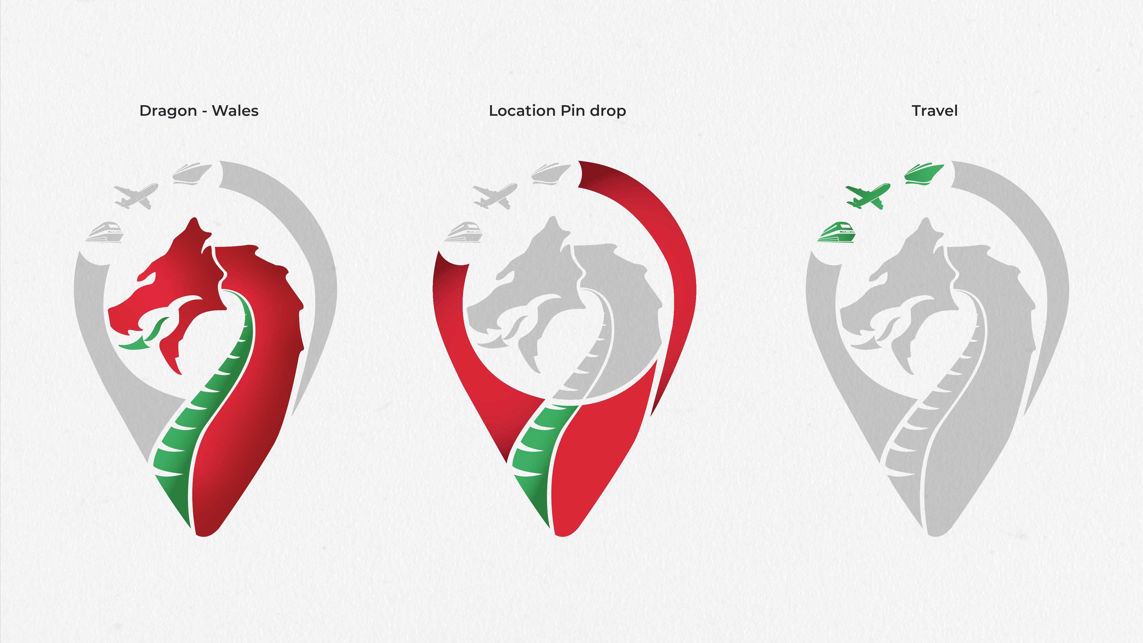
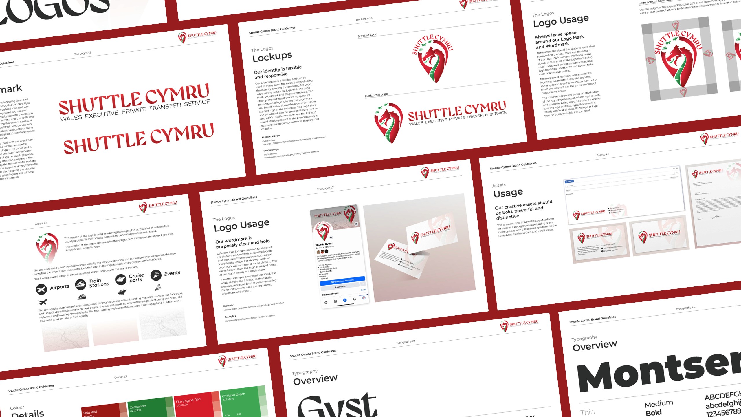
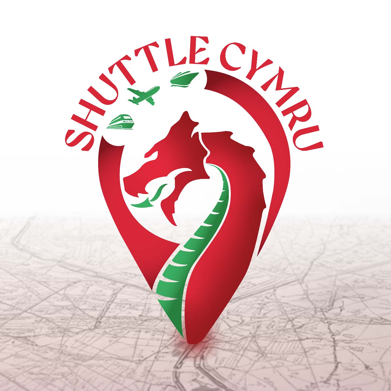
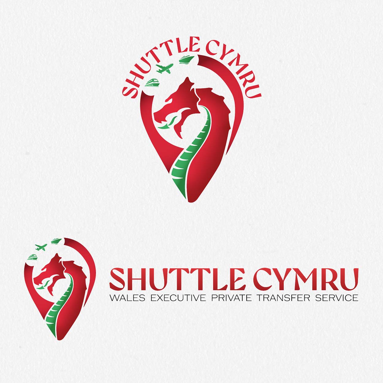
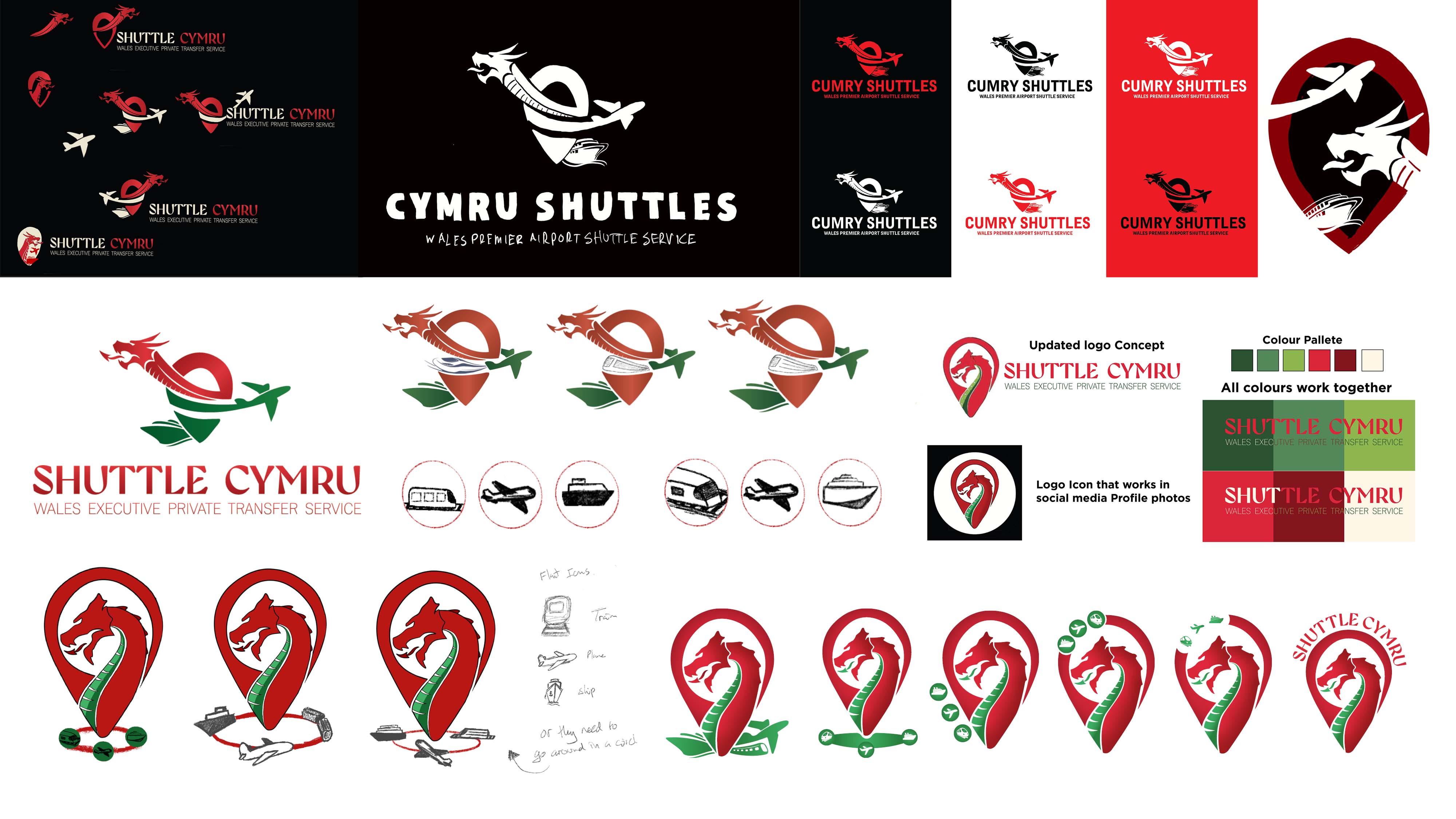
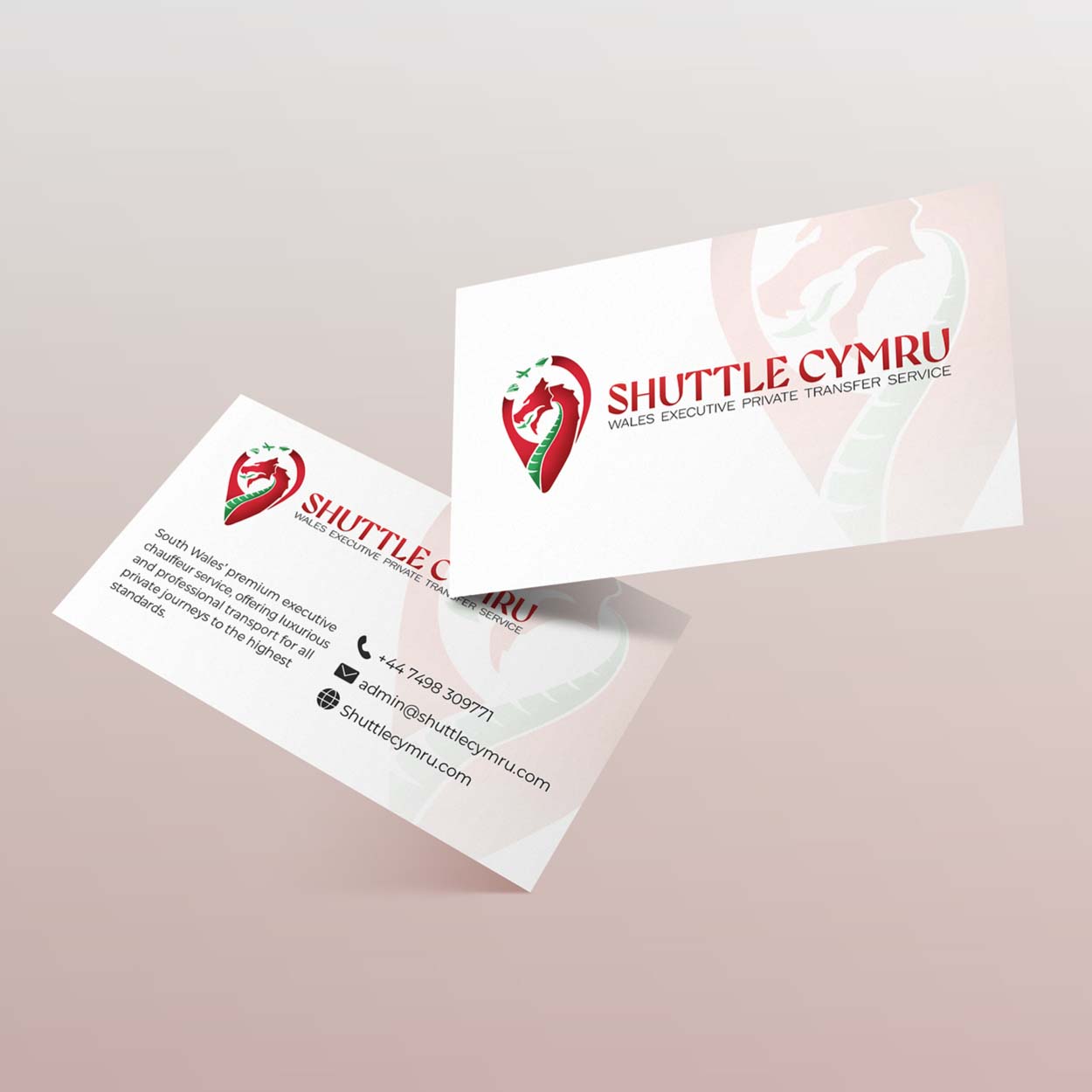
Translating complex client requirements into a modern, legible logo system
Initially, I worked through a lot of designs that included all the elements the client requested, like a plane, ship, and train, but it quickly became clear that the density of those icons was affecting the logo’s readability and versatility in the layout the client originally requested. I had a conversation with the client about these concerns, and we worked together to create a simplified, re-shaped version that still includes every aspect they wanted while looking sleek across all media, even at smaller sizes. The final wordmark was inspired by the elegant feel of the Brecon Carreg brand, capturing the essence of a dragon within the font itself, while keeping it clean and scalable.
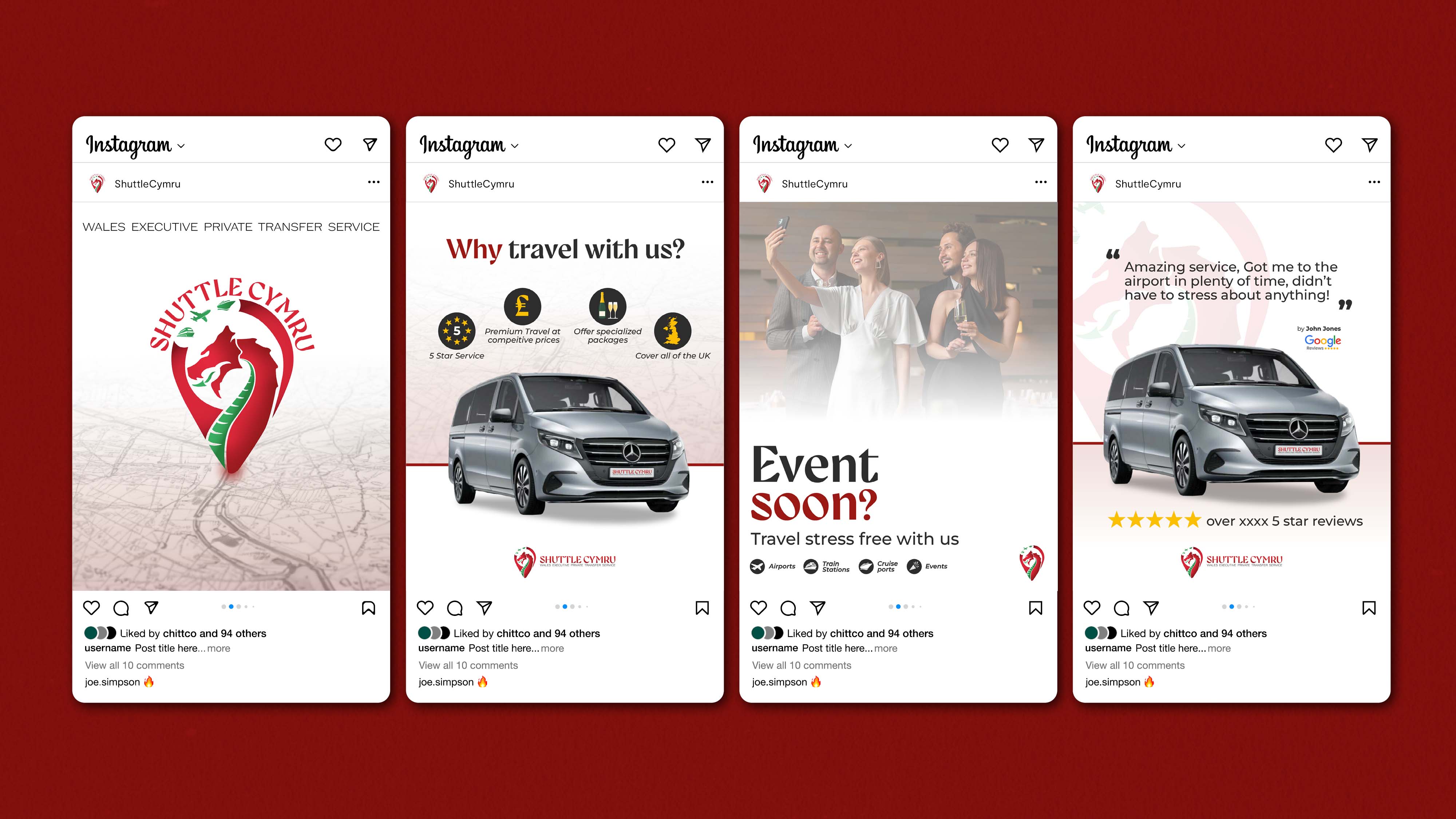
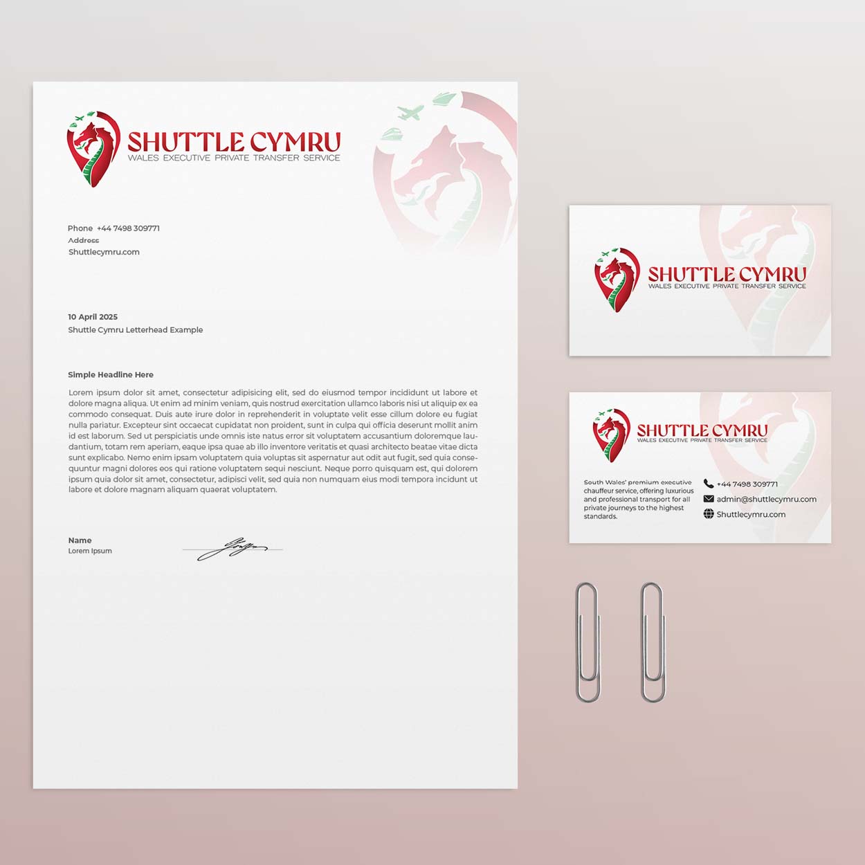
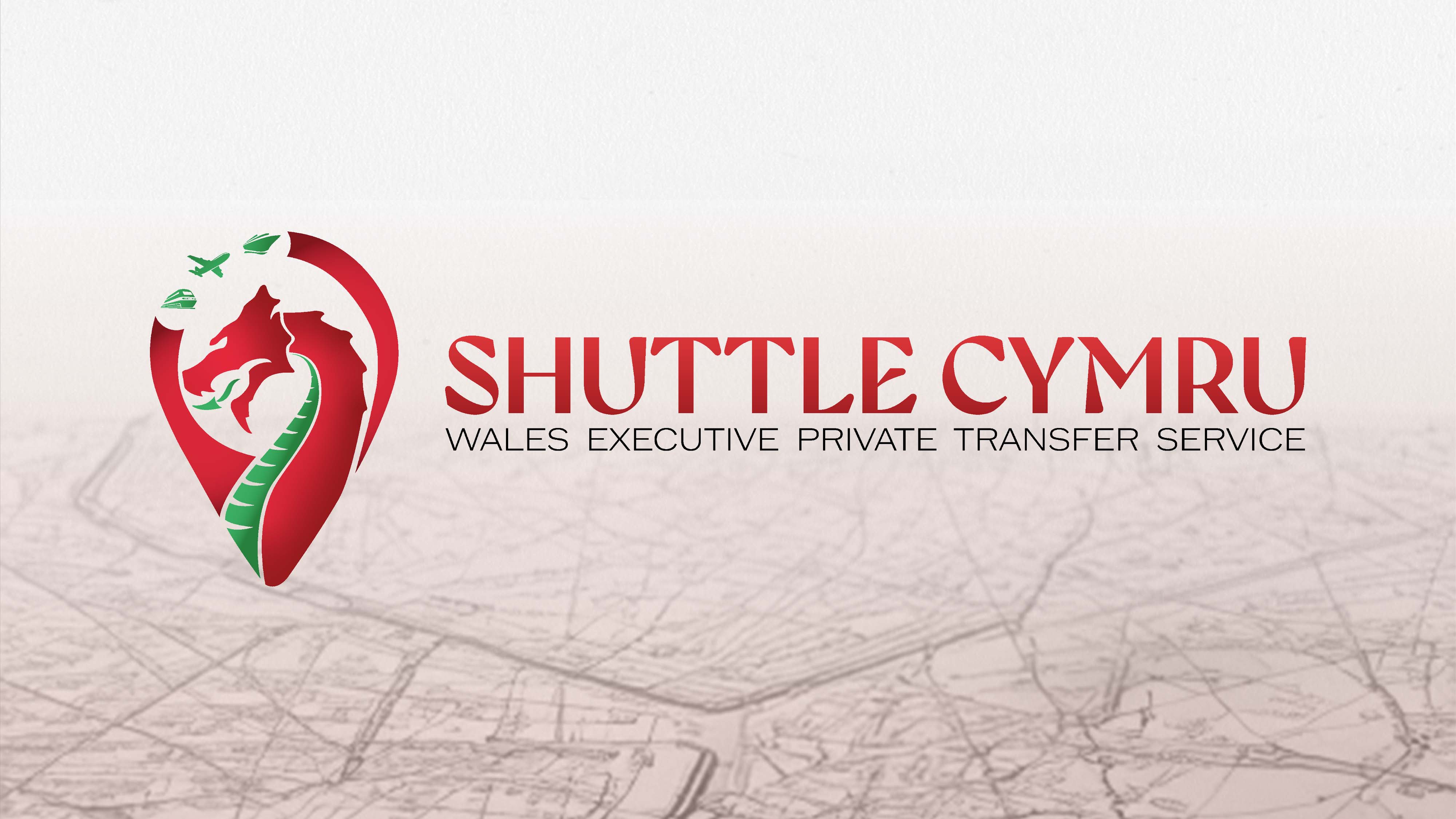
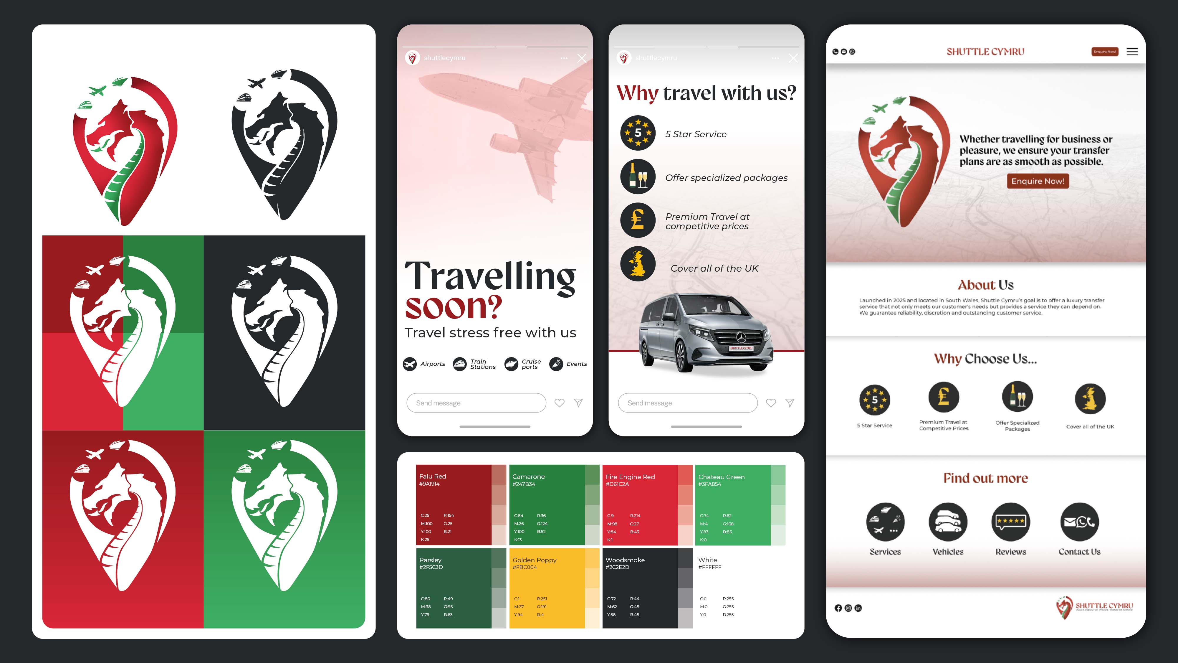
Crafting a frictionless and luxurious digital experience for every passenger
The client was happy with how it turned out. and the visual language is consistent across every touchpoint, using a classic palette of black, gold, and green that gives the brand a subtle, Rolex inspired luxury without ever feeling too busy. We used two specific fonts to keep everything consistent, Gyst for that touch of illustrative character and Montserrat for clean, accessible body copy that is easy for the client to use on their own. The website was designed to be as efficient and frictionless as possible, making it easy for customers to find all the info they need and book their journeys in just a few clicks.