Pathway Jiu - Jitsu
The founder of EKBJJ Wales now Pathway BJJ reached out to me when he was ready to establish a unique identity that felt entirely his own rather than a welsh extension of EKBJJ. He was looking for help to translate the discipline and steady growth of Brazilian Jiu-Jitsu into a modern, minimal brand that could hold its own across apparel and digital media. we began sharing some ideas and from there I crafted a new visual language, ensuring the final logo system was robust enough to represent the history of BJJ while staying true to his vision for a clean, bold, unique aesthetic.
Defining a brand identity that captures the history and future of Jiu-Jitsu
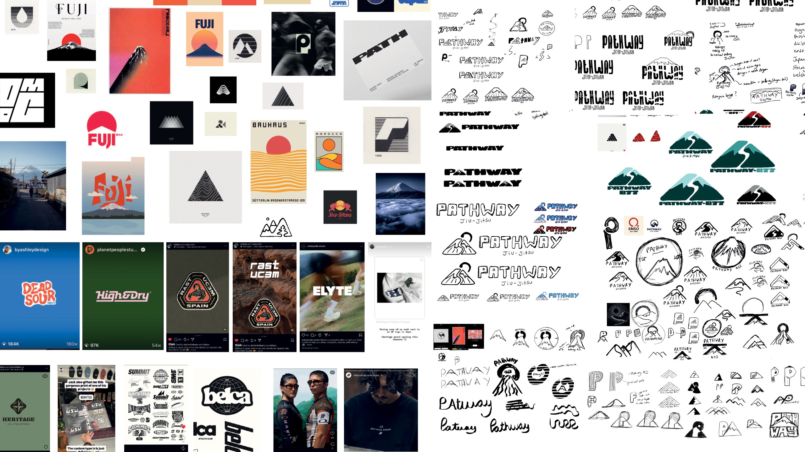
The main challenge was translating the intense, disciplined nature of Jiu-Jitsu into a visual style that didn’t fall back on the usual style, and not using a belt or stripes. I had to design a brand that felt tough and established, yet clean enough to look high end across everything from custom Gis to a modern website. My process involved deep research into classic BJJ symbolism, where I also experimented with how to incorporate a mountain and a pathway to represent the long journey to black belt, while carefully developing the concept to keep the logo minimal, legible, and uncluttered for all the different lock ups, and places the logo would be used.
Defining a brand identity that captures the history and future of Jiu-Jitsu
The main challenge was translating the intense, disciplined nature of Jiu-Jitsu into a visual style that didn’t fall back on the usual style, and not using a belt or stripes. I had to design a brand that felt tough and established, yet clean enough to look high end across everything from custom Gis to a modern website. My process involved deep research into classic BJJ symbolism, where I also experimented with how to incorporate a mountain and a pathway to represent the long journey to black belt, while carefully developing the concept to keep the logo minimal, legible, and uncluttered for all the different lock ups, and places the logo would be used.
Translating philosophy and personal goals into a visual language
I started by diving into the philosophy behind the name, “Pathway,” and the imagery he was drawn to, specifically mountains and the concept of consistent growth. We chatted through a lot of ideas, and I put together moodboards and sketches to make sure we were on the same page. It was all about finding that balance, creating something minimal and modern that didn't feel too futuristic, while making sure the pathway symbolism stayed front and centre as a nod to the long, rewarding journey of Jiu-Jitsu.

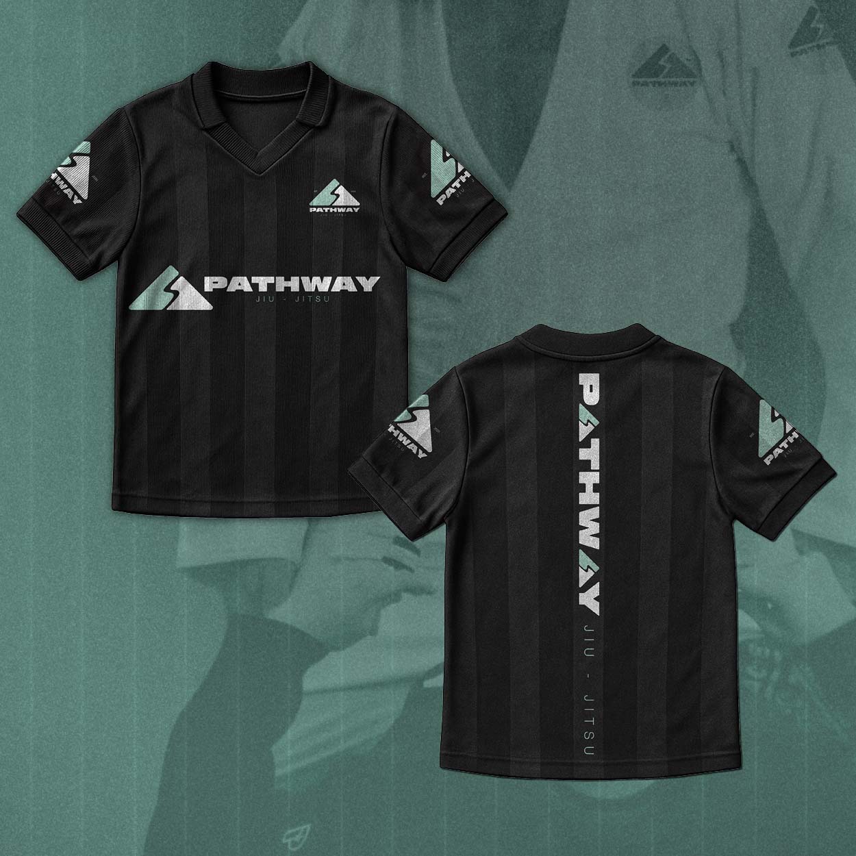
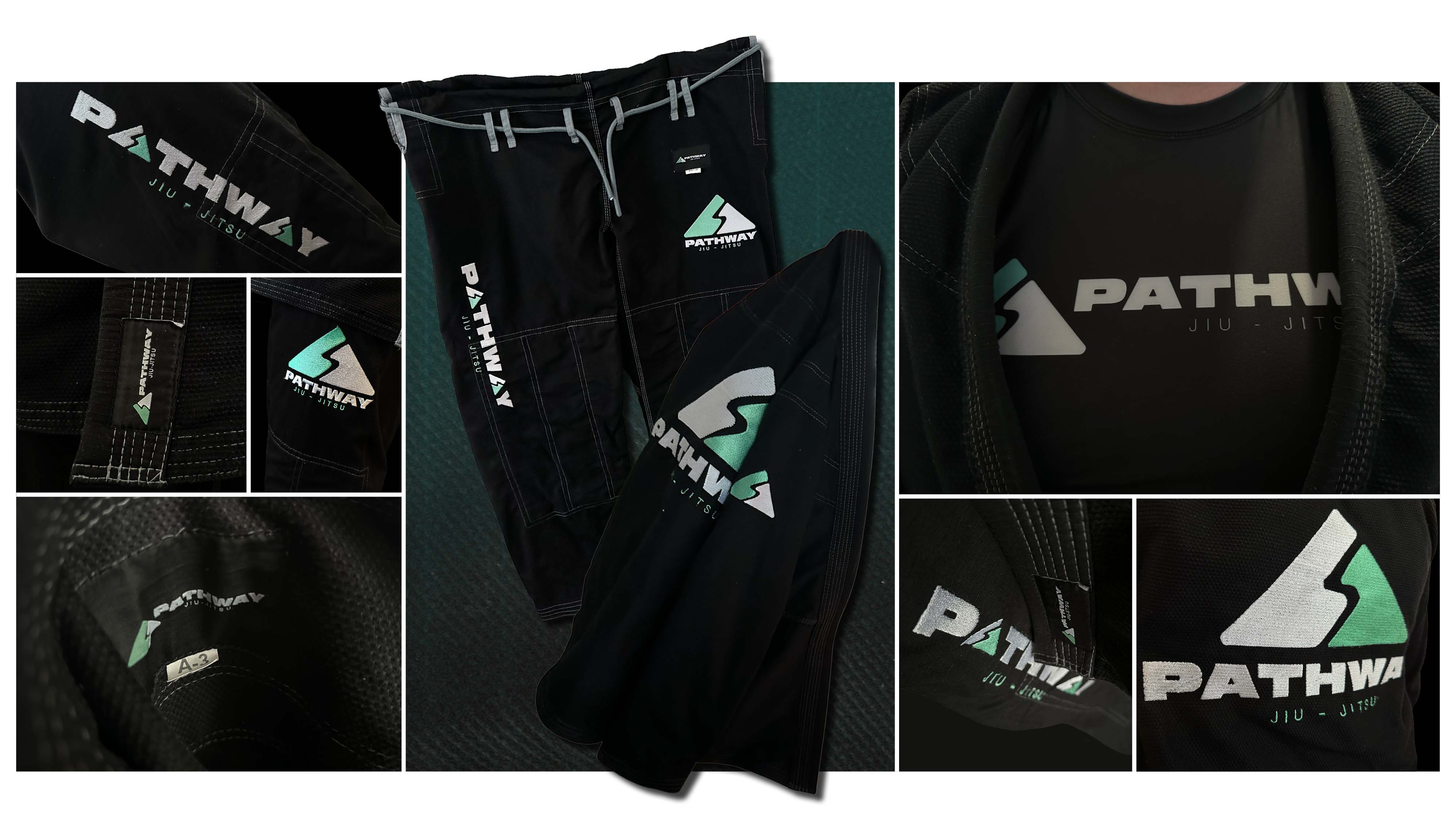
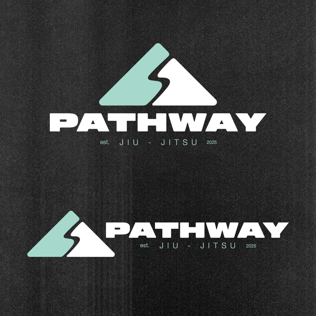
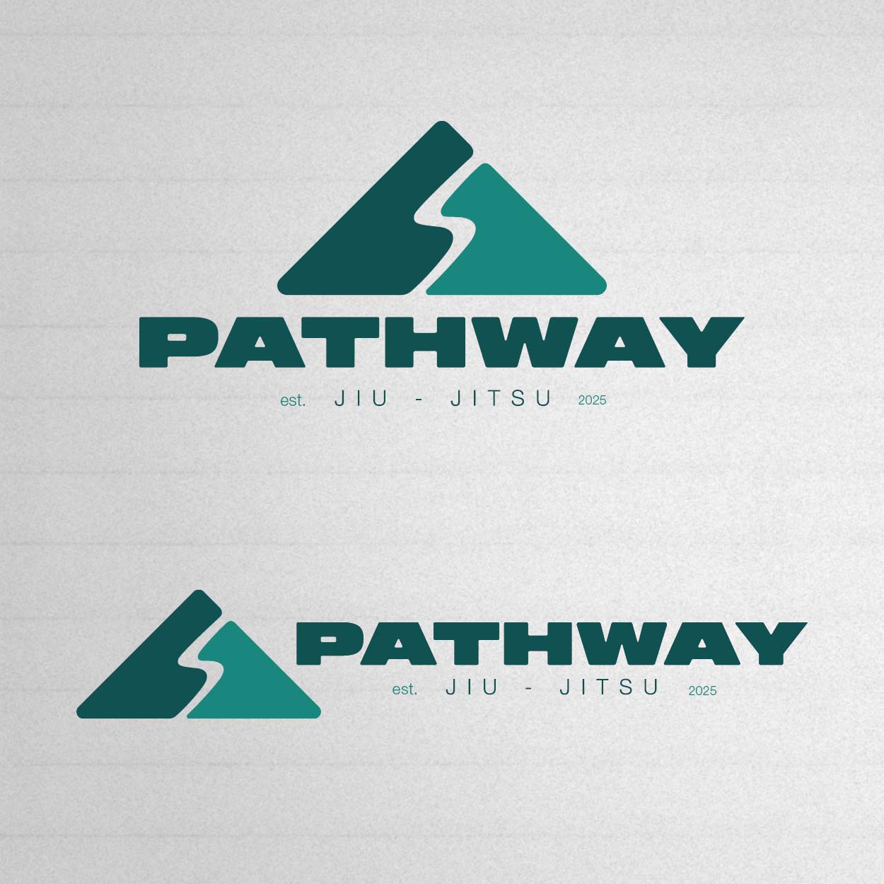
Creating a versatile, recognisable logo system that works on any background
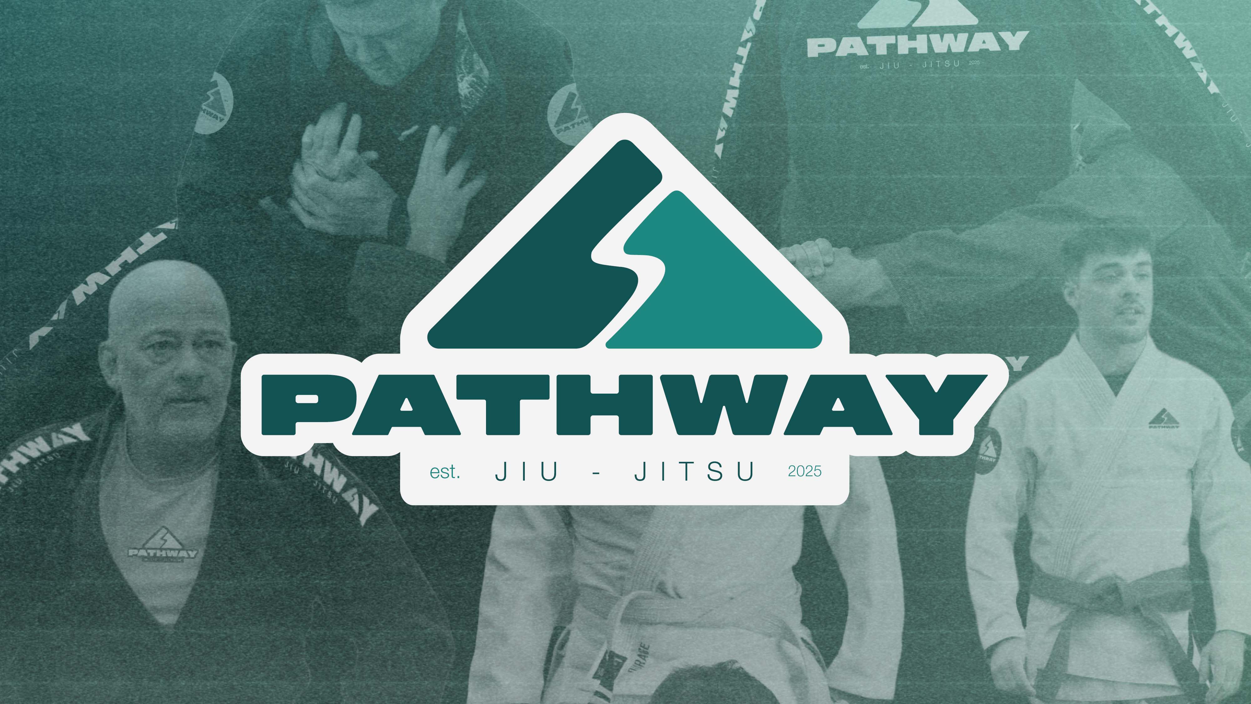
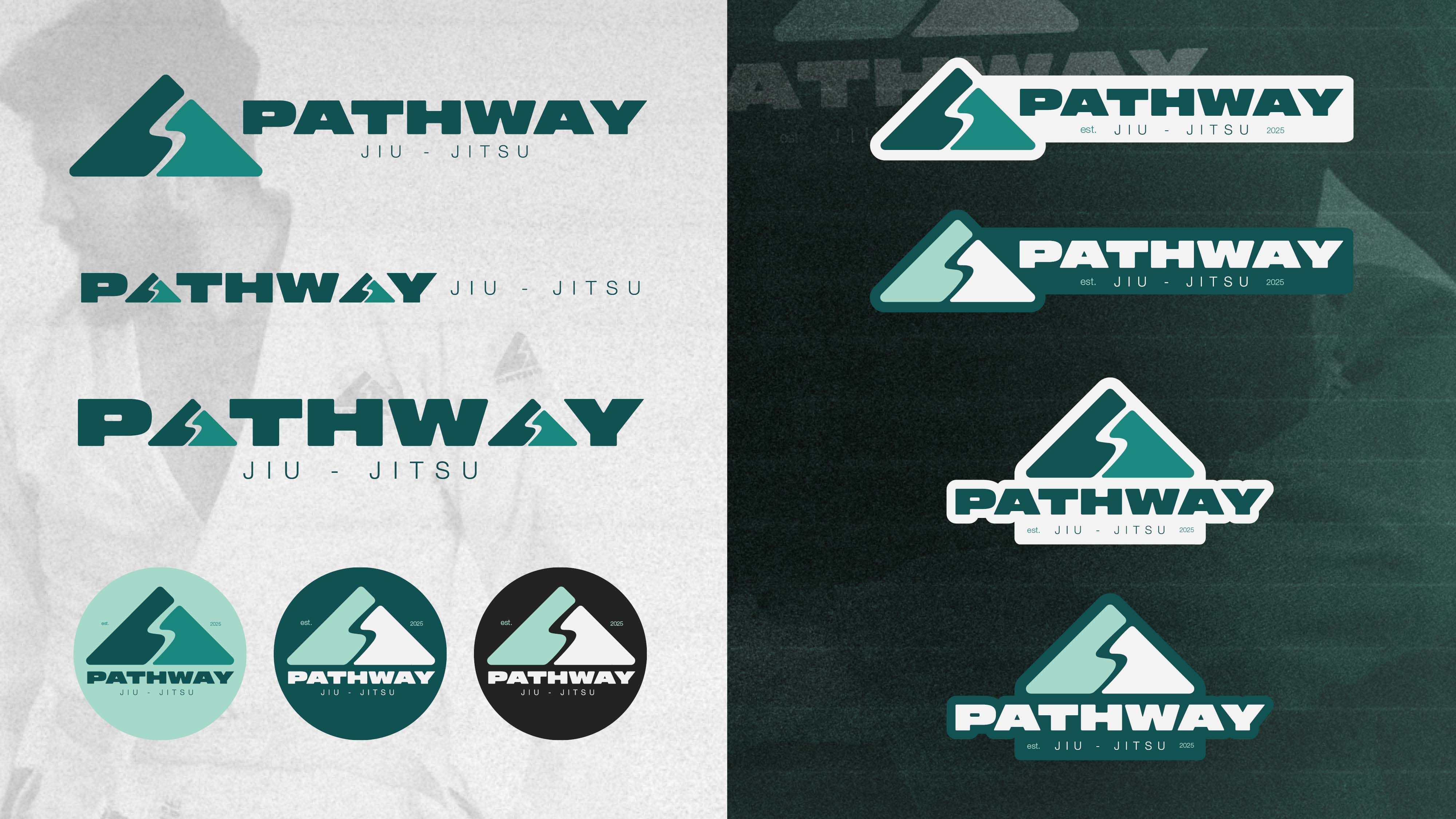
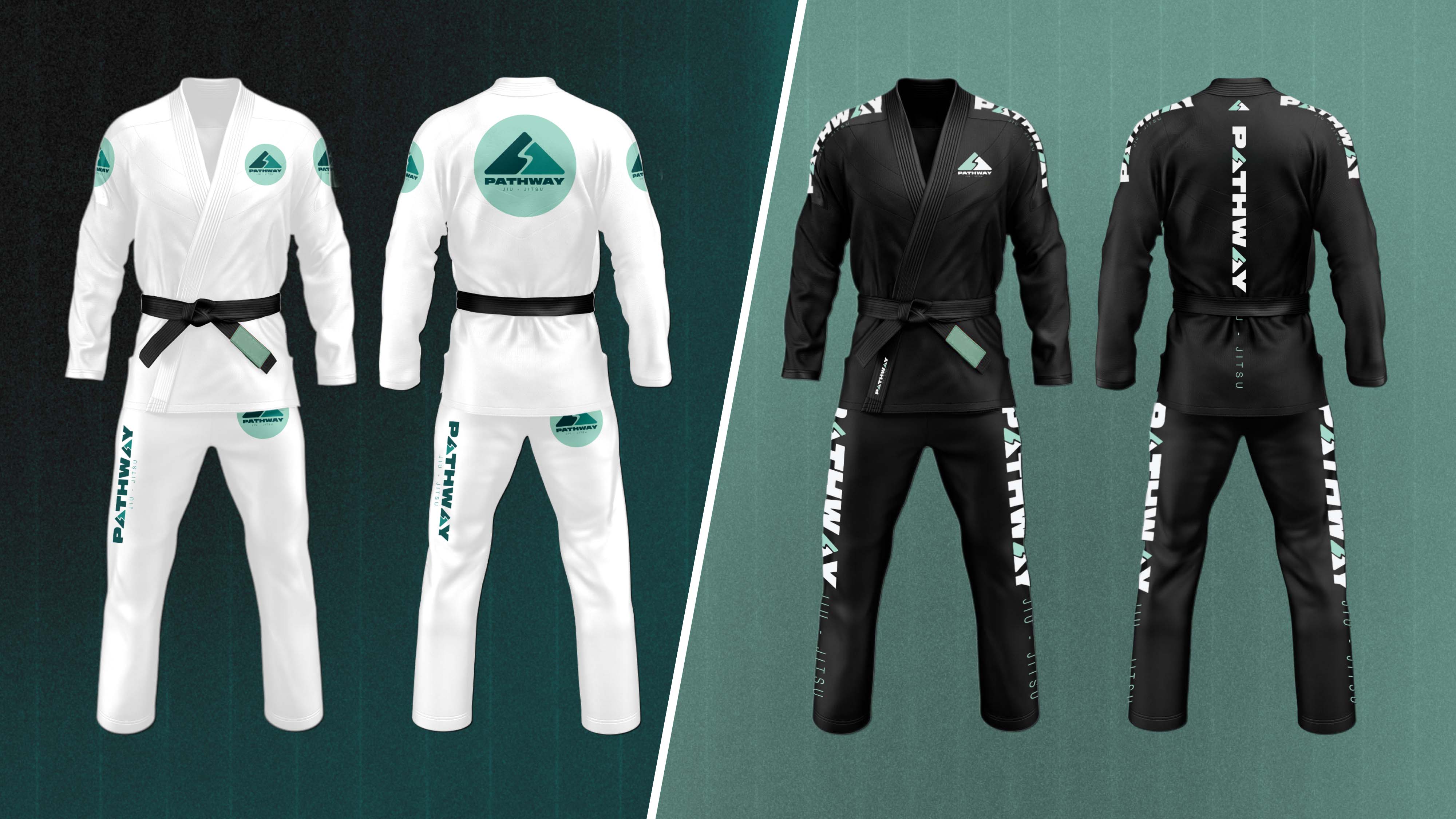
I’m really happy with where we landed. The final brand identity takes that core concept of climbing the mountain and turns it into a sharp, versatile logo system. We worked through the colours to find the perfect mix of vibrant teals and mints that pop, while keeping a darker palette in the mix so the logo looks great on any piece of gear. It’s been a great project to bring to life, giving the gym a look that feels both professional and deeply personal to the sport. I'm proud to be a part of the club and to help bring the brand to life.
Creating a versatile, recognisable logo system that works on any background
I’m really happy with where we landed. The final brand identity takes that core concept of climbing the mountain and turns it into a sharp, versatile logo system. We worked through the colours to find the perfect mix of vibrant teals and mints that pop, while keeping a darker palette in the mix so the logo looks great on any piece of gear. It’s been a great project to bring to life, giving the gym a look that feels both professional and deeply personal to the sport. I'm proud to be a part of the club and to help bring the brand to life.